1 Get Started
Get Started
One of the primary challenges when hiring a company to build your website is effectively communicating your vision and requirements to the designer. With numerous approaches available to achieve a specific goal, an incomplete or vague direction can leave designers with a broad range of options that may not align with their initial expectations. This often leads to iterative changes and potentially increases both time and costs. To optimize the process and minimize expenses, it’s crucial to have a clear understanding of your website’s needs before discussing the project with a designer.
Planning your website:
Website development typically begins with a planning phase to define the desired look, feel, and functionality. This stage can be overwhelming if you lack experience in web design. This guide aims to help you address essential questions and provide strategies, resources, and tools to simplify the planning process.
Purpose
The first step in website planning is to identify the purpose the website will serve. Deciding on what the website’s purpose will be will help determine what design and functionality aspects will be needed to develop a well-thought-out strategy.
- Will the website serve informational purposes only?
- Will it be used to capture leads or future clients?
- Will it facilitate appointment scheduling?
- Will it support online sales of products or services?
- Will it function as an active online community or forum?
- Will it showcase a portfolio of artwork?
Audience
Another decision is: who will this website be directed towards? In other words, who is the audience?
- Is the website intended for potential clients?
- Will it serve current clients and customers?
- Is it meant for public information?
- Will it target other businesses?
- Will it be accessible to members only?
The audience will help shape how to convey information properly so that they understand. New clients who stumble upon a website may quickly scan the page for key words before they commit to further reading and viewing more pages. This will require identifying key words and ensuring they stand out throughout the page.
Other websites may be designed for members of a community to read more detailed information on topics they are very interested in, and they will need to be able to quickly navigate many documents or pages. This will require some sort of table of contents and a search feature.
Ask yourself the above questions, and then visit similar websites to see how they designed the sites to achieve their purpose.
Pages
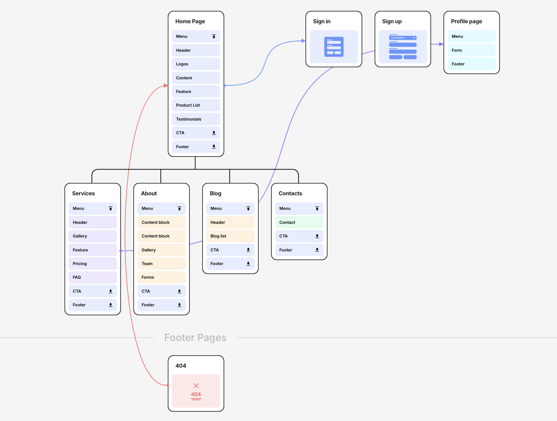
Another step in planning is deciding on what specific pages and features are required. Websites are typically made of several pages linked together, with each page serving a specific purpose. This is known as a site map. There is always a “home” page, which is the first page a visitor sees when they type in the basic website or URL into the web browser. This page can be very important as it serves many purposes, such as telling the visitor what the company and website are all about, providing links to the pages needed, and any other relevant information. Everything starts on the home page and should help to quickly direct the visitor to where the visitor is trying to get to. Other common pages a website may have are listed below:
- Contact Us: This page provides means to contact the website owner or business, such as a contact form, address, phone number, social media, etc.
- About Us: This page provides more details on who the company is and their background.
- Blog: This page provides links to blog articles published by the company.
- Shop: This page provides an online storefront for purchasing items.
- Legal Policies: This page or pages provide the legal policies of the website, such as the privacy policy, terms and conditions, disclaimer, cookie policies, etc.
- Gallery: This page provides a collection of images or videos to share with the visitor.
Decide on what pages will be needed and how they will be linked together for visitors to navigate, then plan out your site map.

Sections
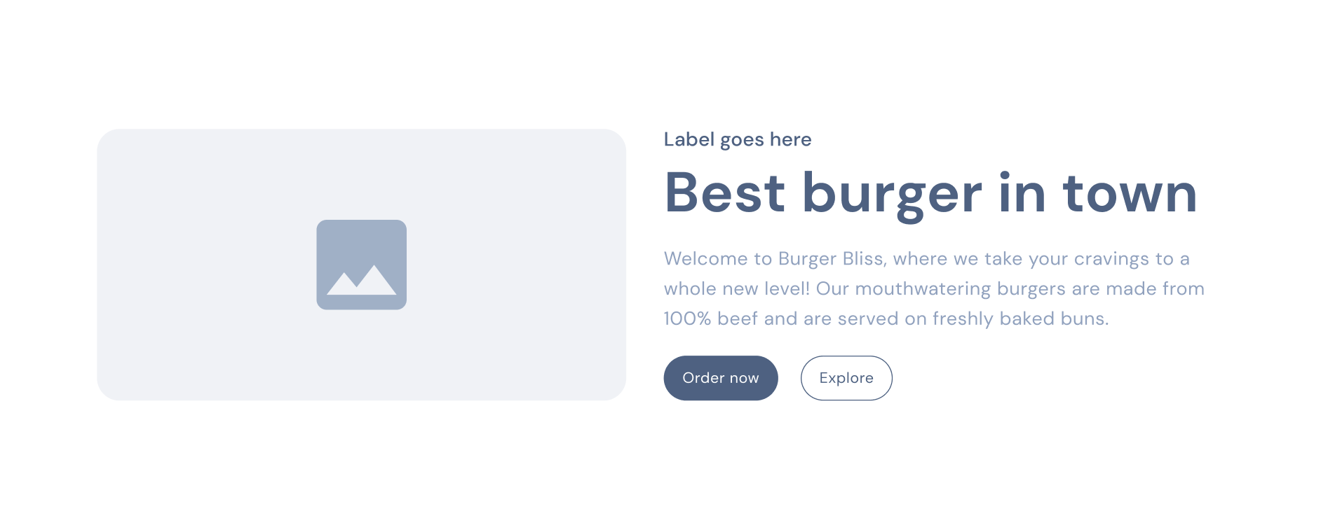
Once the pages have been identified, they will each need to be planned out on how to build them. Pages are usually long, vertical pages that go beyond the height of a typical monitor, and the visitor will scroll up or down to view the entirety of the page. Therefore, pages are usually limited to a specific width, with several “sections” stacked on top of one another that fit within the display of the monitor. Pages can have as many or as few sections as needed to deliver the proper information they are intended to. There are many ways to create sections for many different purposes and layouts. Below is a link to several examples of common sections. It is recommended to spend some time visiting similar websites to identify the types of sections they use and what can be accomplished. Once you have identified what sections you would like on each page, the next step is to provide copy for those sections.

Copy
Pages and sections are mostly words and images, with some decorations, such as boarders and backgrounds, added to them. There are two ways a designer can go about drafting up a website in the beginning. First, they can use “dummy” text and images for the time being just to get the overall layout completed. After it is complete, they can go back and add in the text and images provided by the client. This method can work, but there is less strategic planning involved, and it is more about filling in space. The other method is to plan out exactly what the client wants on the page as far as text and images, and then the designer will develop how that will be displayed to properly convey the right message. This method required the client to provide the copy (text) up front as well as images.
The copy for most websites will be a series of headings, sub-headings, and small to large paragraphs scattered throughout the site to navigate the visitor as well as provide the necessary information about each section. This can be product names and descriptions, features, team member introductions, testimonials from previous customers, as well as sales pitch words and phrases. To help develop this, look at several other similar websites and see what type of copy they use. Identify what seems to work and captures your attention or answers your questions, and consider incorporating a similar strategy into your own website.
Images
Just like copy, images make up many websites. They can be added in as filler, as an afterthought, or strategically planned out. A designer can use placeholder images temporarily to get started with the design, but it is better to have the images up front so that they know how many, where to place them, and how to structure the website to convey the proper message.
Considerations for choosing images:
- Size: The quality and size of images also matter, as this will affect the quality and speed of a website. Images should be large enough to be clear and visible on larger screens, but not so large that the file itself is several megabytes, as this will slow down the loading of the website.
- File type:
- JPEG: Best for photographs and images with many colors. Offers a good balance between quality and file size.
- PNG: Ideal for images requiring transparency or those with text and sharp edges. It typically has a larger file size but maintains higher quality.
- SVG: Great for vector graphics, logos, and icons. It scales well without losing quality and generally has a small file size.
- WebP: A newer format that provides high-quality images with smaller file sizes compared to JPEG and PNG. It’s supported by most modern browsers.
- Copyright: Are the images used protected by copyright? Where you find your images, matters based on copyright and usage rights. To prevent illegal copyright claims, use the following guide for selecting images: The best sources for images
- Relevance and Purpose:
- Content Matching: Ensure that images support and enhance the content on your website. They should be relevant to the message you’re trying to convey, whether it’s through product photos, illustrations, or background images.
- Purpose: Decide the role of each image. Is it to attract attention, explain a concept, provide context, or break up the text? Understanding the purpose will guide your selection and placement.
- Accessibility:
- Alt Text: Provide descriptive alt text for all images. This helps screen readers describe the image to visually impaired users and improves SEO.
- Contrast and Visibility: Ensure that images have enough contrast against the background to be easily visible. This helps users with visual impairments.
Theme
Now that the structure has been decided, we can begin the fun part, the theme. The theme is the look and feel of a website. This includes the color scheme, the font choices, the layout style, the icons, backgrounds, and overall feel of the website. Does it feel playful and bright? Does it feel rigid and serious? To help shape the desired theme, there are several considerations.